MA 213-A Spring 2011
This page is designed to be a tutorial of sorts which covers some of the basic tasks one can accomplish with R. Much more complete documentation can be found here. You are invited to read it, search for more help online, and try to come up with your own solutions to the homework before looking at the examples I provide below.
Table of Contents
Setting Up R
R should work in any GNU/Linux flavor, OS X, and Windows. In all cases, there is a very nice GUI which allows you to edit script files and run selected portions of them. In fact, you should not have to use the command line at all, unless you really want to. Nothing works better than a hands-on demonstration, so feel free to bring your computer to class or stop by my office if you need help to get started.
One of the common pitfalls is being unable to find the data file. If this is happening to you, make sure that R's current working directory (GUI has an option for that) is set to wherever you put your data.
It also came to my attention that OS X may sometimes save text files in UTF-16, which poses problems for R. If you are trying to read a file, and the file is found, but the data seems to be ALL wrong, make sure you save the text file as UTF-8 plain text.
Data Files
To download files, right-click them and choose "save link as..." or something like that.
Over-the-Year Change in Unemployment Rates for States [csv], Monthly Rankings, Seasonally Adjusted, Bureau of Labor Statistics.
UMass professors' salary [csv] for 2007.
Active nuclear power plants [csv], Statistical Abstract of the United States, 2007 (Table 918). U.S. Energy Information Administration, Electric Power Annual.
SAT scores by state [csv], College Entrance Examination Board, 2006.
Most powerful women in America [csv], Fortune, Nov. 14, 2005.
Forest fragmentation study [csv], Wade, T.G., et al. "Distribution and causes of global forest fragmentation", Conservation Ecology, Vol. 72, No. 2, Dec. 2003 (Table 6).
Chinese herbal drugs [csv], Guiqiu, H. "PAF receptor antagonistic principles from Chinese traditional drugs". Progress in Natural Science, Vol. 5, No. 3, June 1995, p. 301 (Table 1).
New Zealand birds [csv], Evolutionary Ecology Research, July 2003.
Warm-up Exercise
Download unemployment-rates.csv and try visualizing the data in various ways. To load the data frame, first make sure that you are in the right place. It is most convenient to be in the same directory as your data file. You can see the working directory by running
and change it by running
Alternatively, you may use GUI to set the default working directory (this is the way to go if you use Windows). Once there, run
attach(x)
Now x stands for the entire data set (run
to display it) and State, Dec2009, and Dec2010 stand for data columns with state names and their unemployment rates respectively. Now you can display all rates as bars:
where las controls the labels' orientation and cex.names controls their font size; or display a histogram for rates:
where xlab is a label for the x axis and col is a vector of colors; or make a box-and-whiskers diagram:
or print a stem-and-leaf plot:
or print a summary with various statistics:
HW 0
Data Input
Typing It
R's basic data type is a vector: a bunch of elements indexed by natural numbers. To specify a vector of numbers directly, you may use a command like
The c() function creates a vector with specified numbers, which is then assigned to the variable x. You can see the value of your vector:
You can access individual elements by specifying the index in brackets: x[0] is the first element, x[1] is the second, and so on. The function c is very flexible: it concatenates its arguments (a fancy word for pasting vectors one after the other), whether they are vectors or individual values, so you can, for example, "double up" your vector by saying
x
You can use vectors in arithmetic expressions, and R will try to apply indicated operations element by element:
Distribution Sampling
Another neat way to create vectors of numbers is by using the pseudo-random number generator. For example,
creates a vector of length 100 with numbers taken seemingly at random (actually, sampled from the uniform distribution) on the interval .
Reading Files
You can also input data by having R read it from a csv file. This may be the most practical way to do it. You can create a csv file by hand in any text editor by following the specification, or you can enter it in your favorite spreadsheet program (such as LibreOffice's Calc) and save it in csv format. In either case, it is good to have names of columns in the first row, that being the way R understands csv files by default. Once you navigated into the directory where the csv file is stored, you can load it with
d now contains a data frame, which is basically a table. The columns of a data frame are vectors and there are many ways to access them. To be concrete, I will load my own file:
I can see the names of columns with
and I can get the vector with salaries by saying
Alternatively, I can run
after reading the file and then refer to columns by their names:
...
[911] 135760
Displaying Statistics
To display various statistics based on the data stored in a vector x, just run an appropriate command.
Mean, a.k.a. arithmetic average:
Median:
Standard deviation:
Variance:
-th quantile ( for the median, for the first quartile, and so on):
Minimum:
Maximum:
Sum:
Getting More Help
You can ask R for help with any command by saying
Unless the help window is GUIfied, you can scroll the help text with arrows, exit with "q", and search it with "/".
HW 1
Printing
To print text from the console, just copy and paste.
Both Windows and Mac OS shells allow to print the graphical window from the application menu. You may, however, opt to save the output into a file. You can say
to save the graphics as a PNG file (800 pixels wide, lossless, near-universal support), or
to save as SVG, a superior vector graphics format with little to no support among proprietary applications such as MS Word.
Comparing Data Sets
To compare several sets of numbers, one may use side-by-side box-and-whisker plots. I will do it with unemployment rates (the file was updated since the warm-up exercise, so get it again).
attach(x)
names(x)
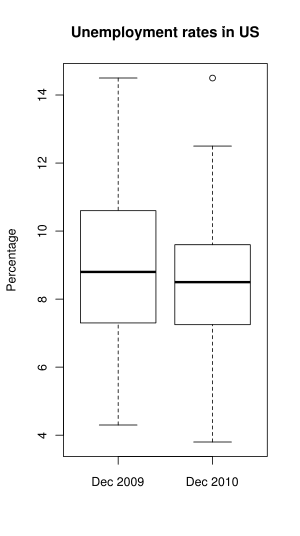
As you can see above, giving multiple columns to boxplot caused it to display plots side-by-side. More than two columns may be given. names argument specifies a vector of labels below, main specifies the overall title, and ylab specifies the label for the y axis.
If your data sets are paired, as it is here, then it makes sense to explore the paired difference. Make a new data frame out of x, sorted by the difference in unemployment, call it s:
And display the difference with a bar plot:
barplot(s$Dec2010 - s$Dec2009, names=s$State, las=2, cex.names=0.6, ylab="Paired difference of unemployment rates between 2010 and 2009")
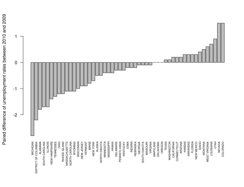
Making sure that complex graphics are displayed nicely is never easy. Above, I called par to adjust the outer margins, so that state names fit; in particular, the bottom margin is made to be 4 "lines" thick. Then I plotted the difference between the columns of s, with label names coming from the State column. las=2 turned the name labels sideways, and cex.names=0.6 reduced their font size. Before you plot other things, it is good to restore the default margins:
Finding The Modal Class
The mode is the value that occurs most frequently in a data set. When we are dealing with the data measured on a continuous scale, though, it is highly improbable for two data points to coincide, so it makes sense to talk about a modal class: an interval with the most data points. A modal class of unemployment rates in 2010 is readily seen on this histogram:
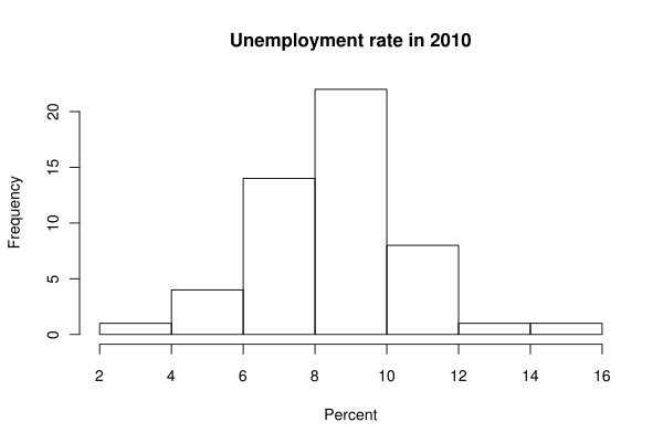
So the modal class is the interval from 8 to 10 percent. Note that the modal class is dependent on the way you break up the axis into classes:
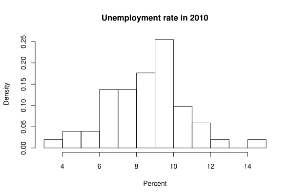
Now the modal class is the interval from 9 to 10. Here nclass is the suggested number of classes, and freq=F changes the y axis labels to display the density, which is similar to relative frequency.
Skewness
Many texts are simplistic to the point of being wrong when it comes to skewness statistic. The skewness characterizes the way the distribution "leans", but it is not the same as the mean being less than the median. Do it right: compute the sample skewness precisely. Here is an R function:
skewness(Dec2010)
So the sample is skewed slightly to the right.
HW 2
I will use the file with New Zealand birds [csv] to demonstrate the tasks in this homework.
Working With Subsets
names(birds)
[6] "NestDensity" "Diet" "Flight" "BodyMass" "EggLength"
Display body masses that are between 100 and 200 and count them:
Finally, I want to make a new vector which contains all body masses except for the 3 largest ones. We cannot select by an inequality because it may cut off more than three data points. So I find out how many elements there are:
And then I select all but the last three elements in a sorted vector:
Now trimmed.mass is a vector with three highest masses omitted.
Computing The z-score
To compute the z-score for the highest data point in BodyMass, I can say
That is, I computed directly.
Detecting Correlation
If I suspect or desire to detect any correlation (linear relationship) between two data columns (in this instance, between body mass and egg length) I can say

Well, it looks like some kind of relationship, but certainly not a linear one. But why should I expect a linear relationship between mass and length? I can guess that the mass of an animal is roughly proportional to the cube of its length, so let's plot the cubic root of the mass against the length:

This actually looks like the data can be well-fitted with a straight line.